uiojk's art web site
Tips on Ref Sheets
2024-06-14 updated: 2025-04-07
This article is a work in progress on some notes and observations I've gathered from using ref sheets when making illustrations for others.
Ideally No Shading
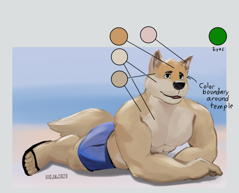
A ref sheet with no shading is usually better for the purpose of making new art from the ref sheet, but if there is shading, make sure all the solid colors are available in a swatch palette somewhere, with lines or arrows pointing to example regions where the palette applies. Oftentimes a character might have two similar colors in the palette and arrows can disambiguate which goes where.
While the artist that does the ref sheet might be quite skilled and may want to offer such a ref sheet, ask if they can provide a flat color version as well.
Having a shaded ref sheet that has no palette is not ideal, as each artist will color pick something a bit different.
Preferably in PNG
This is a small detail that isn't as big an issue as the previous thing but basically it's better to get a lossless copy of the ref sheet from the artist for archival purpose and to provide that lossless copy for the commissioning artist for reference. There are many reasons for this.
If it is saved in JPEG, depending on the software, sometimes it is saved at "95%", "90%", or maybe even lower, because I imagine most people tend to forget that those settings even exist when they export it from their paint program. The lower the percentage the more amount of information is removed from the image.
If you get a PNG or TIFF then it is a lossless format. If you get a JPEG it is always a lossy format. If you get an image in WEBP or some other new format, it can be either (but very likely lossy). Many web sites recompress your JPEGs into WEBP to save a bit of money on bandwidth cost, in which case it is lossy.
Some web sites take the opportunity of an uploaded lossy JPEG as an invitation to compress it even further and hoping the user won't notice.
The reasons are many but one pertinent to ref sheets is the color information won't be quite as good as if it was kept as a full color PNG. For one, when color picking a JPEG image, there will usually be a "worble" of hue fluctuations wherever there is a hard edge nearby, such as the border of a palette swatch in the image, if your swatch color circle/squares aren't large enough then the color sampled will have some fluctuation to it.
In this example, I made a new image in GIMP where I fill an ellipse selection with a color, in this case: C5317A
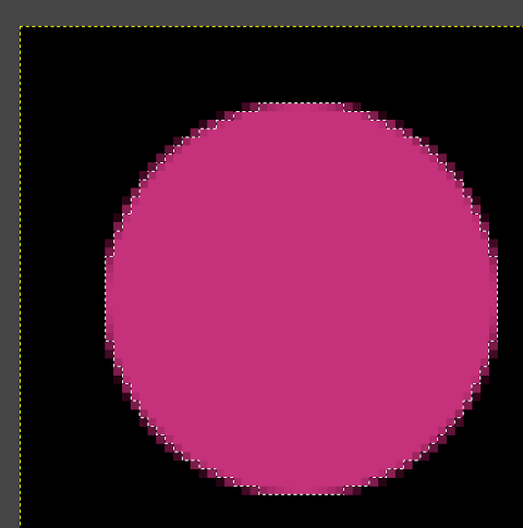
After saving to JPEG, and then reopening, the filled ellipse has a visible ringing of hues near the edges, with colors ranging in values such as C5317B (sampled near the center with the least distortions) and BB3074 (near the edge).
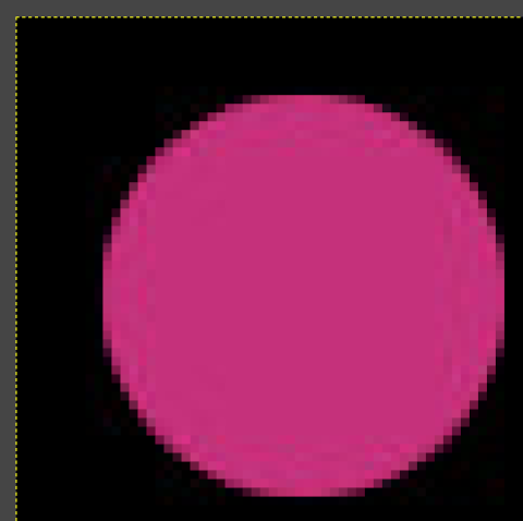
Also JPEG images usually aren't actually stored in the red, green and blue color components like many other graphics formats such as PNG, it is more similar to television and videos in that the color information is separated from the luma. When saving to JPEG, RGB is transformed to YCbCr, so the color hue can sometimes shift ever so slightly from the compression, and from there depending on the quality settings, sometimes the color information is downgraded further as a change in color information is not as noticeable as a change in the luminance to the human eye.